
Whether you’re using classic PowerPoint, collaborating in Slides, or even feeling a bit creative and using Keynote – well designed presentations can be difficult to pull off without a bit of design help, but definitely not impossible.
Now I’ll get onto my soapbox in regards to why a well designed presentation is important: People “buy” with their eyes. Whether it’s to actually buy a product or buy-into your ideas, nice visuals aid the process of acceptance. Also, how many times have you sat through terrible presentations and realize that you haven’t retained a single thing.
But don’t forget, if the content is terrible, the most well designed presentation is not going to save you. Unless your audience can easily be fooled by smoke and mirrors (in which, why are you presenting to them anyway?). /end soapbox
Ok, to provide some credibility to why I am speaking to presentation design, I’ll share a template I designed from scratch. This is to demonstrate that you don’t have to be a designer (I am not a designer) and you don’t need any special tools to build a nice looking presentation (all images and graphics were built and “designed” using native Google Slides tools). See below for a template (you can copy this presentation if you’d like to leverage some of the designs – although note: this is not fully designed in the Master slide). Hopefully they aren’t terrible when I think they look good (um, let me know if they suck).
Here’s some key do’s and don’t’s that will at least make life much easier for you when you’re creating a new presentation.
The do’s
The don’ts
Examples
Resources
The Do’s
Do: Always start with your brand’s template
If you decide to start with the default (blank) template in PowerPoint or Slides. The template should be doing its best to keep you on brand – fonts, colors, and styles for your brand. Start here and presentation building should not be difficult.
If you don’t know where the template is (ask!). A design or marketing team will have made this publicly accessible. If you don’t have a template, you should create one. Presentations are one of the most widely used business tools, I would be shocked if you could go through your entire career without doing one.
Do: Copy any slides into the new template and use destination theme
It’s super easy to do this in both PowerPoint and Slides. You just can’t do this from Slides TO PowerPoint or PowerPoint TO Slides.
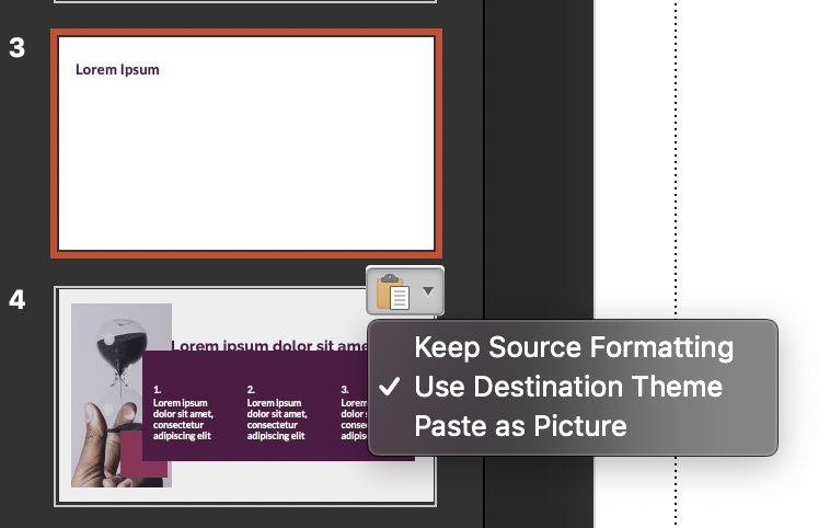
2. Once pasted, use the clipboard icon at the bottom right of your slide that’s in the sidebar and select “Use Destination Theme” to convert the slide to your template’s defaults.
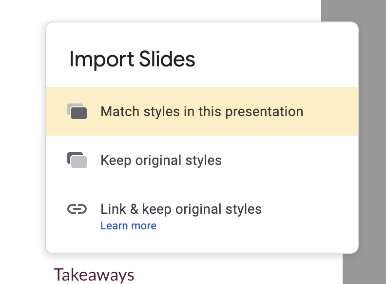
2. Once pasted, you will get the option to select what to do with the styling – select “Match styles in this presentation” to use the template’s default.
Do: Use align and grid features to ensure your text doesn’t “jump around”
Do: Be authentic
This should go without saying, but presentations are often when your insecurities and/or your ego are most easily identified. And it 100% can show within the words that you choose.
The Don’ts
Don’t: Use the wrong font – or multiple fonts
Your brand should have a standard established font – use it. If not, choose something simple (Arial sucks, don’t use it, and definitely don’t use Comic Sans). While we’re on it, don’t use rainbow coloring on your fonts.
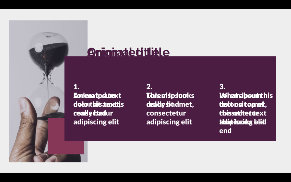
Don’t: Word barf on a slide
You’ve all seen it, the slide with far too much text aka word barf. While the person is presenting, you’re not listening and reading every single word. Don’t be that person.
Don’t: Use clip art
There’s nothing more unpolished and unprofessional (and not to mention dated) than clip art. Just don’t do it.
Don’t: Overdress your text or images
Using shadows, bevels, or 3D looks unprofessional and often juvenile. If using any of these features, they should be implemented by a designer.
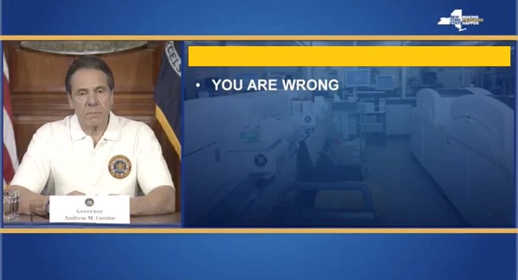
Don’t: Place text over images
Unless you have an overlay that lends itself to making text pop, don’t put text over images. It’s impossible to read.

Don’t: Use animation
Leave animation out of professional presentations. They can break and what’s more embarrassing than text that was supposed to replace other text layered on top of one another OR animation out of order.
Examples
I am a huge fan of great presentations. They bring me joy, and even better, they are memorable. Who wants to do a presentation and no one can recall anything that you’ve said? (Definitely not a marketer, but I’m sure most other people as well). Otherwise, why do it?
Sagi Haviv of Chermayeff & Geismar & Haviv (one of the world’s best design agencies) is a master of presentation & storytelling. I had the privilege of seeing him live at Creative Mornings in February You can watch a similar presentation he did on visual identities at TEDxPenn.
How a Strong Brand Boosts B2B Demand
In Content Strategy, L.E.S.S. is More
Resources
- Royalty-free stock photography – For any (internal) presentations where you need to find an image, Unsplash is a great resource. Because it’s royalty free, you shouldn’t be using any of these images in presentations that are for profit (example: don’t use this in a sales deck).
- Stock photography – My favorite source for great photos is Stocksy. The photos are high quality, professional, and non-cheesy. Also, inexpensive!
- Color palette selector – For those who are building from scratch (without brand guidelines or preset colors), it may be useful to determine your color palette ahead of time. Coolors is a great way to generate a color scheme and get the hex codes to enter into your master template.
- Design inspiration – I’ve pinned a lot of presentation templates that I use for inspiration in designing slides.
Header Photo by Charles Deluvio on Unsplash